Next Steps
91% and a new look

Render Feedback
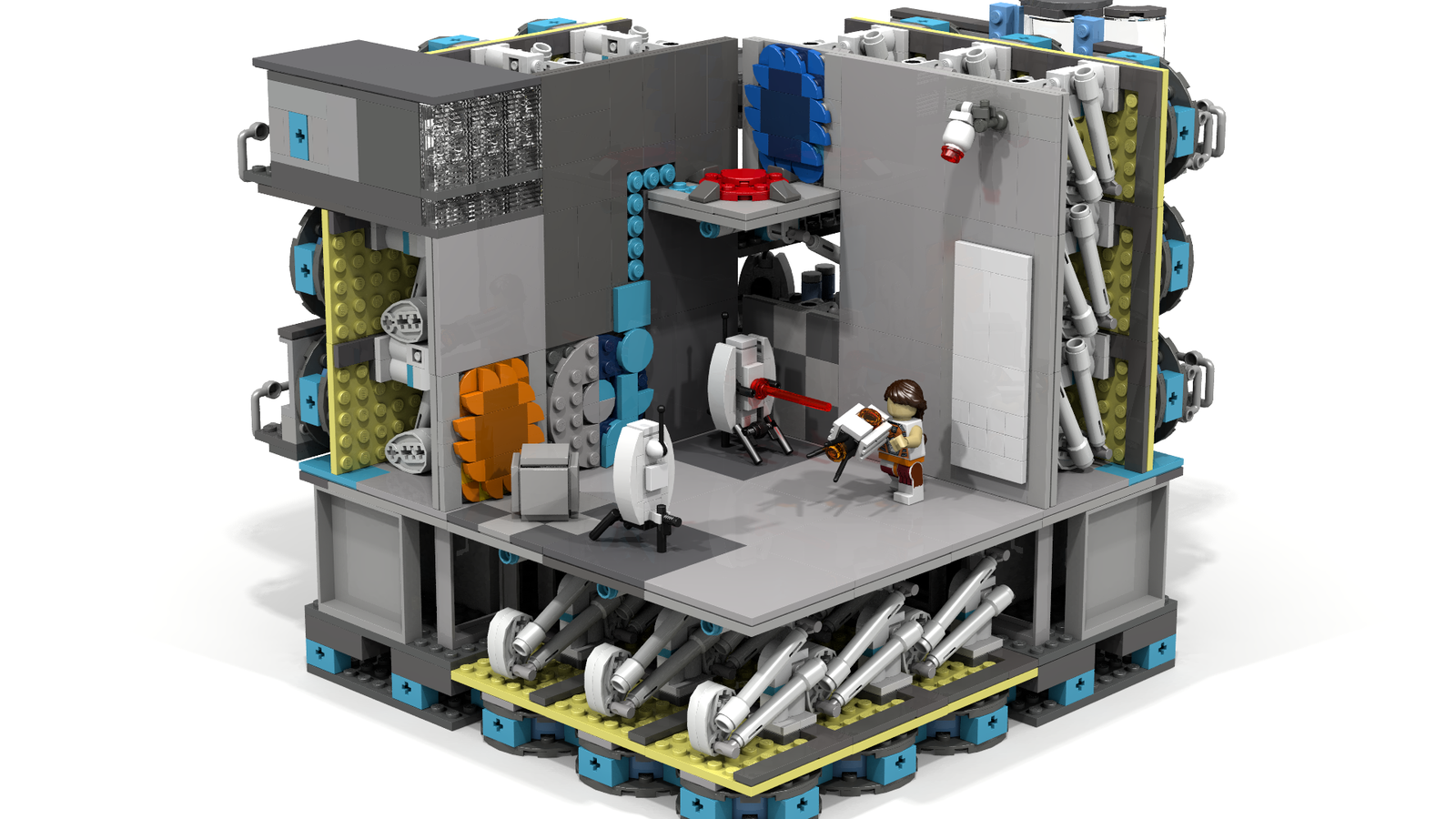
I'd like feedback on some renders of test I want to update the description with. I'm planning 3 at least: modern, overgrown, Wheatley Labs. The overgrown one has a 4 by 4 footprint, it's not done yet.
What could be better about these images? And what do you like? (The goal is to show off the most different test chamber elements between the three images. I'd like to show off that you can create a really tall chamber as one of the tests)
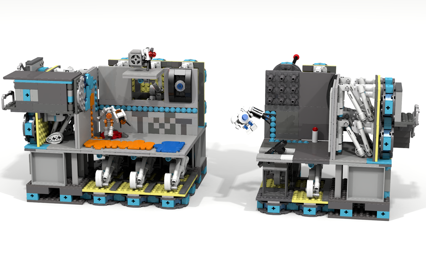
While I'm asking for feedback, what about these images that try to show off the behind-the-scenes details?
Thank you for the help! I want the new description to be as slick as possible :)
Test Signs & Portal Reloaded
Hey everybody! I'm rerendering everything I've got to update the description, and I wanted to show off my Test Sign and Time Portal.
The Test Sign has two vertical 2 by 4 tiles which are supposed to have a printed 0 and a printed 1, and a few other numbers to change the Test Number. The sign also has eight 1 by 1 tiles which are supposed to have the little pictures on them. I never figured out adding custom prints unfortunately, is there a way I can make it more obvious that they can be switched out?
The Time Portal is from an incredible (free!) mod coming out on Portal 2's 10th Anniversary. It is seriously, seriously cool, it fundamentally changes gameplay. If you haven't seen it, check out the trailer: https://www.youtube.com/watch?v=lD-BZWfhY3g I have the pleasure to be a Beta Tester for the mod, and the author has given me permission to include his Time Portal in the chamber. The tests with it are awesome, and it fits this set well because you can also "time travel" to different eras (overgrown, modern, Wheatley Laboratories).
I need some help designing the main promotional image for the set. This is probably the last chance I'll be able to update this project's main images, so I want to hear all your ideas for how I can show off the set better. Thanks everybody, we're almost there! :)
Test Signs
Hello everybody!
I have been recieving several requests to add Test Signs to the chamber. My first question for everyone is: what would be the best size for the sign?
I am conflicted whether to make it take up a single or a double panel surface. I would really want a single, so the chamber has lots of playable space, but in-game it is rectangular. The below image is in-game:
I would love to hear from you all, and what your thoughts are on how to Lego-ify these signs.
Thanks for your continued support! :)
Aesthetics
Hello everyone! I have been struggling with rendering software, so I will just post what I have as an update instead of a new project overview.
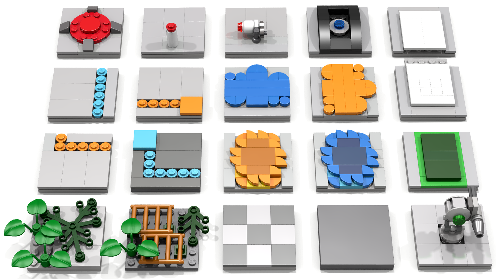
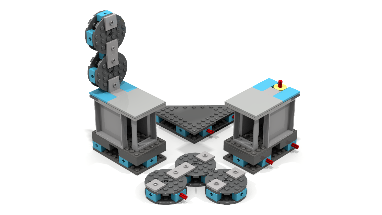
I am working on making the project page better, with more accurate colors for multi-tasking panel arms and more exciting promotional images. Let me know what you think of these panel colorings and images, I'd love to hear your feedback! I want the project to look as good as possible, so evaluate these images as promotional material; do they explain the project well? Of course there will be more showing tests and overgrownness, this is all I have so far :)
1. Modular unit (fewer parts)
2. Connections
3. Anglers
4. Modular System
5. Panels (fewer parts)
6. Poseability
7. Surfaces
8. Interactive Details
9. Exterior Details
9.5. Chamberlock, Observation room (LDD and POV-Ray takes AGES on the clear parts)
10. Full support system
Also, we just passed 7,000! Yay! :D
Elevator!
Quick preview of the new & improved "support system" as I'm calling it (all the walkways and behind-the-test stuff). Cheaper and better railings, and a pretty spectacular elevator design!
The elevator acually opens, can stop at each floor, is not height limited (can start at the top and fall all the way down to old aperture if you disable the safety stop), and is fairly accurate to in game. You can exit the test through the working chamberlock doors, take the elevator after the test to your next destination, and arrive at an observation room for a comprehensive assessment of your test. I'm very excited for this addition. Oh, and who can forget our favorite nanobot of unusual size? (See you in court, Jerry!)
More to follow ;D
1 Year Anniversary
Short update today! There's a lot I'm working on: 50% support promotional video, new parts and elements, outreach to gain new supporters (and who can forget IRL Finals Week? :). But nothing with significant enough progress to post, yet.
But today is a special day, it's been one year since I went public with this idea. The journey has been amazing, so much more intense and positive than I had expected. Thank you all for your support, shares, and great advice, without you this project would not be here.
Happy Cake Day! :D
Continue Testing
Lego Ideas has a contest going on right now to create a virtual background for Zoom, Teams, etc meetings. I've created one, and it gave me an idea: I've been using it during online classes, and it's caused some people to support the project!
Sharing the project with people is the best way to increase support, so feel free to use this as a custom background if you'd like! I'll create a few better ones with different scenes from the games, with a QR code integrated so it's easy to support :)
I've been working on preparing a project description re-write, which includes re-rendering images. I've also been producing a 50% supporter video, that's in the works as well. The "trouble" is the influx of ideas, both in the shower and from all the wonderful supporters! You all are super helpful, I really appreciate all your suggestions and feedback on the chamber. It's getting better and better, I'm really excited about it! :D
That's all for now, continue testing!
Support Skyrockets!
So
A few days ago I posted a graph of the sudden support this project recieved. I commented how that was the 2nd most support in one day of all time (184 supports). Here is that image:
Now, after that I went on Reddit a few days later to promote my project. I posted in Gaming and crossposted to Portal, Portal 2, Aperture Science, GLaDOS, and a few others. This was the result:
This astounding spike of support happened after 22,000 upvotes on the subreddit, which got this project to the top 25 of all Reddit.
Unambiguously amazing, 1223 people created Lego accounts just for this project!
However, I've learned some things. Numerous comments mentioned that the image I posted was missing Portals, asked if it was modular, and said they wished it was more interesting. They also asked why the walls were so thick. Some people who clicked on the link DM'd me and suggested some improvements for promotional material. I'm working on better renders now, including a single image that shows the chamber in the three main "eras", each with different features and configurations shown off. Hopefully using better promotional material in the future will increase the conversion rate from 5.5% (People who supported that day / Number of upvotes).
I think a great idea is to publish some images for promotion that anyone can download, to make promoting this project easy for them! So I'll look into that as well.
This spike happened overnight, I posted about it and went to sleep. The next morning, it was in full swing. It was an amazing feeling, thank you to everyone who has supported this project so far! As we approach 5,000, I need to produce better promotional materials to get this project all the way to 10,000. After this milestone, there are no more day boosts.
An absolutely ENOURMOUS thank you to those of you who have been long time supporters, without you this project wouldn't have gotten off the ground. A giant thanks is owed to every supporter that commented with ideas, improvements, and suggestions, you help this project get better and better! I'm so grateful for your input, you help make this project the best possible version of itself. The people who take their own time to promote this project are in their own category, you help grow this project beyond what I could do myself.
And of course, even the small nice comments matter! Reading them makes me really happy :)
I wrote this post on the fly, no drafting involved, which is why it might sound less polished. To conclude, here's both graphs of what I see as of today; May 2nd lifted the success trendline by a very noticeable amount!
Thank you for everything, it's been an amazing journey! :D


