Help your fellow builder by leaving your feedback based on these three criteria:
- Originality: How original is this - never seen before?
- Building Techniques: How much skill do you think the creator of this MOC has, in terms of building technique?
- Details: Express how much you like the details of the build.
Your feedback is only shown to the creator as well as yourself. It is not available for other users to see. The creator won't see your user name.
Redesign!
Hello everyone!
It's been a while since I first uploaded this project, but do not worry, I haven't abandoned it. Since posting it originally, I have almost completely redesigned the project and so in this update, I will be showing the changes I made. 
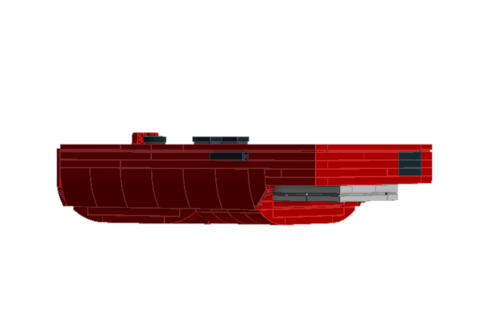
First, I will start off with the front. Next to the screen, I added the little power light, represented by a red round tile, as well as changed the power switch on the side to be a modified plate so that it actually sticks out a little bit from the side of the model. Next, I decided to round out the back of the design using some sloped plates rather than full bricks, as you can see in these next couple of screenshots.

From the side, this change is much more noticeable:


I think the more rounded look is a bit better than the previous version, where I was using inverted slope bricks to get the curve, and it just looks a lot more smooth. I have been working on another project on the side, and some complications led me to redesign this one. In order to do this, I had to basically change everything except the very top layers of the model, and it took a very long time to do it, but this was all so I could change the size of the game pak. Below, you can see the old design on the left, and the new, wider design on the right for comparison.

The new version of the Game Pak not only looks better, but the build is much stronger as well, and doesn't fall apart as easily in real life. Well, that's all for now, but be sure to keep an eye out for my next update, coming in the next couple of weeks, where I will be showing the physical version of the model so you all can see how it looks built in real LEGO.
Thank you all so much for your support!
