On
NEW VERSION COMPLETED!
So this is the new version of this MOC, I hope you like the end result. PLEASE help us reach 10K by sharing this project within your LEGO communities! Every support counts and helps! Also follow me on IG @bricks_fan_uy for more updates and lots of other MOCs and free instructions!
Now the pics!


On
REDESIGNING THE MOC (PART 4)
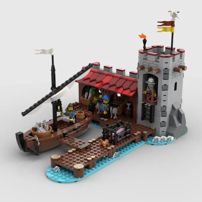
Finally I got to work in the right wing of the build. This completes the whole structure of the castle/port with an added food stand, a turret and a pier.

The roof from the food stand used to be removable, but the space inside wasn't all that playable as it was too narrow. So, I gave up that mechanism for a simpler tilted roof with more texture and color than the slopes. Better looks for slightly lower playability.
I also changed the door position for the tower to create a difference with the tower on the left of the build which makes the it a bit more interesting, I think.
The new boat is simpler, less 'pirates' and more 'medieval'. Also the dock now pins to the rest of the section instead of being held merely by the baseplate.

On
REDESIGNING THE MOC (PART 3)
This section has been the most challenging one. The goal was to make the castle's shape more interesting but also to spice up the interior of the build a bit more.

I added a wine cellar/storage area on the inside, that mini build served both as scenery and also to make the interior cavity less deep, hence keeping it more playable for minifig posing.


Also, to make up for the interior of the main build being split between Section 2 and 3 I chose to continue the cobblestone way that comes from the main gate to the inside of the harbour. That splitting was a tough decision, the previous version had a whole different approach but I think this one makes for a more stable and easy to transport build. At the end of the day, the exterior of the harbour is this MOC's focal point/scene, not the interior.
Hope you like it so far! If you do please help me get the word out and tell your friends, share, comment, like so this gains the traction we need to get to 10k!
And remember to follow me on Instagram so you don't miss the latest updates and tutorials!
On
REDESIGNING THE MOC (PART 2)
Next part is the main square tower. This is the entrance of the castle and it also has the harbour masters office. I made this section so that it can be pinned to the first section, so its easier to transport.
A section of stone built dock disrupted excess of brown in the build and made the center of the build (this main tower) a bit more prominent.
Remember to follow me on Instagram so you don't miss the latest updates!


On
Redesigning The MOC (Part 1)
I've been working on modding this so it only contains current parts and existing colors. To be honest, that means re-designing the thing from the ground up. While I'm at it I thought I'd fix some weak traits of the original design so stay tuned!
My main goals for the newer version will be:
- not use printed panels or any old gray bricks or parts
- make the build splittable into not less than 3 parts
- think a better solution to access the interior, different than just moving one part that it's barely attached
- turn the main building (the tall tower and the main tower) into one single section
- optimize the plates used for the base
- give the whole build a more modern vibe, and probably shrink it a bit to be able to remain under 3000 bricks.
Don't take my word for each of those, they are just my goals. That said, here is a pic of the WIP of the left wing of the build, which is gonna be the first section. What do you think?


On
Back to the rodeo!
Hello! It's been a long time since the last update, time is running out and we are somehow close. I'm thinking about ways to make this better so other people might support. If you have any suggestions about things to change or improve in the build, they are always welcomed! Just leave it in the comments!
On
Level of detail
Since the build was way below the 3K pieces I decided to start adding details to it, so it looks more attractive.
· New revamped market stands
· Added detail to the walls and towers with masonry bricks
· New ship design
· New interiors, the Lords chambers is now an office for his harbourmasters duties and is accesible by minifigs from the rampart through a new door
· Added animals (pig and chickens)
· Modified minifigs and took a couple of redundant minifigs out
· Changed the hot oil in the main towers cauldron for water, to make it less agressive
· Reinforced baseplates
Hope you enjoy these mods and remember that every share counts!


