Help your fellow builder by leaving your feedback based on these three criteria:
- Originality: How original is this - never seen before?
- Building Techniques: How much skill do you think the creator of this MOC has, in terms of building technique?
- Details: Express how much you like the details of the build.
Your feedback is only shown to the creator as well as yourself. It is not available for other users to see. The creator won't see your user name.
On
Slurms MacKenzie in da house!

The Original Party Worm came over with an ample supply of Slurm™ (It’s Highly Addictive!) to celebrate 800 supporters with our crew!
Who can resist a beverage made from the anal secretion of the Slurm worm!? Mmmm-Mmh!
Bender wouldn’t be Bender if he didn’t use the opportunity to nick as many cans as fit in his belly!
Come and join the party!
(This public service announcement was brought to you by Slurm™ – It’s Highly Addictive!)
On
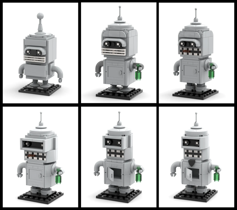
The Many Faces of Bender Bending Rodríguez

Fun fact: my Bender BrickHeadz did not always look like he does today!
Bender was one of the first Futurama BrickHeadz I tried to design, and the first version looked much more blocky than the sexy sleek robot you see now in the „Futurama: Welcome Back to the Year 3000“ project.
Initially I thought it was a clever idea to use a fender piece to frame the eyes. Here is the hilarious very first draft:

The teeth were done with grill pieces and the door on the torso could not be opened.
The next iteration made Bender taller with a usable door in the torso and attempted to round the head out a bit on top. Also the clunky antenna was replaced by the lever piece that is still used today.

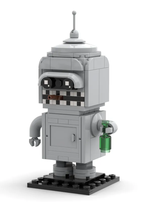
Next came the mouth: the 1x1 plates with black dot on the side from the Architecture line were a much better look for the teeth and allowed to put a (I’m gonna say) „twig“ in Bender’s mouth. I removed that later for the IDEAS submission, so that it would not be mistaken for a cigar (*wink* *wink* *nudge* *nudge*). IDEAS submission policy is very strict about the non-smoking rule!

This was also the version I initially published on my social media and used in the first IDEAS submission for my Futurama project.
But I never was completely satisfied with the look of my Bender BrickHeadz, and after some months I decided to revisit him.
I had a long hard look at the Bender from the show and realised that the head of my version was just too blocky and square. And while this is a standard for BrickHeadz I felt that I needed to break out of that for a successful Bender BrickHeadz.
I felt at this point that the fender piece didn’t really work as well as I thought. Bender needed to have the eyes completely enclosed and I decided to try and make the enclosure square instead, but the head more round. Here are a few versions I tried:

And at first I wanted to use this:

Note that I also „rounded“ out the body a bit by putting slopes on the sides.
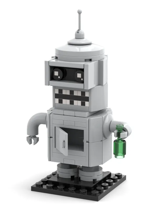
But benders head is much smaller than the body and this still felt off. So I tried to make the head smaller and I think this is a much more successful look and makes my BrickHeadz immediately recognisable as Bender. This is the final version I settled on:

Having nailed down this design also lets me have more fun with it! A little modification and my Bender is changed to Flexo:

Fun fact: the goatee is a very rare piece that only ever came in one version of Unikitty in the blind bag series!
And I also created one Santa Claus Bender:

Sometimes a design is just not finished on the first attempt and it can be really rewarding to revisit your MOCs if you feel there is something that isn't quite right.
I hope this little behind-the-scene excursion was fun and interesting for you and you agree with me that the journey to arrive at my „perfect Bender“ was worth it. Let me know in the comments.
On
From Digital to Real
Hi folks, we just hit 300 supporters and to mark the occasion, I wanted to give you a behind-the-scenes glimpse into my process for designing my MOCs using the example of the little Planet Express spaceship that is a central element of the display stand.
When I first created the stand and the backdrop I did it digitally in #Bricklink Studio, with little regard for the color availability of the parts.
I used bright green as primary color for the Planet Express ship and green for the wings, and this was the result:

Once I decided that I want to build it in real life, I soon realized that I had to do some changes. There were too many parts missing in these colors: I changed it to lime/dark green instead, and even then I had to change the wings.
This is what I came up with:

This is also the version you can currently see on the project photographs at this time.
What always bothered me was that there were some off-color parts that seeped through and how I finagled together the side wings. Also, looking at reference pictures the windows are really too dark.
Fortunately, some of the parts – like the 1x1 inverted bracket that you can spot in cool yellow behind the second window – have become available in the right color now.
I also had another look at the wings and have now revised the design! I’m missing a few parts in the needed colors for now, but I have already ordered them, so expect to see an updated Planet Express ship in the next project revision!

Of course, if LEGO decides to make this an official set, getting the color scheme closer to the original should be no problem, as they often recolour existing parts for new sets.
I hope this little backstage excursion was interesting and fun for you. Please leave your feedback and thoughts in the comments!
On
It's the little things...
One thing that's always irked me about the Leela design was the mouth. I knew I had to give her lips, and I do like the reverted dark pink rounded 1x2 plate for it. But what was always distracting was the bright pink shafts of the 1x1 round plates that I used to mount the lip piece.
Back when I first designed Leela that piece was only available in bright pink (and the rounded 1x2 plate was not). But now – thanks to the Friends product line – that piece exists in dark pink and I tried it out yesterday.
I think this looks much better, and I will of course include this change in the next project revision.

On
Ugh... who's counting?
Good News, Everyone!
We let Calculon 2.0 do the inital part count for the model, but now found out that he's just an actor!
So instead of the 2000 parts listed in the description, the model only consists of ca. 1200 parts!
This means it will be cheaper once LEGO releases it as official set and you can buy two of them!
I will correct the part count in the description with the next bigger update! Stay tuned!
