On
Introducing Overhaul Update 1.1!
Featuring brand new realistic renders! It’s like I can reach out and touch it!
And new black backgrounds, black, the thinking man’s background color!
And new behind the scenes content!
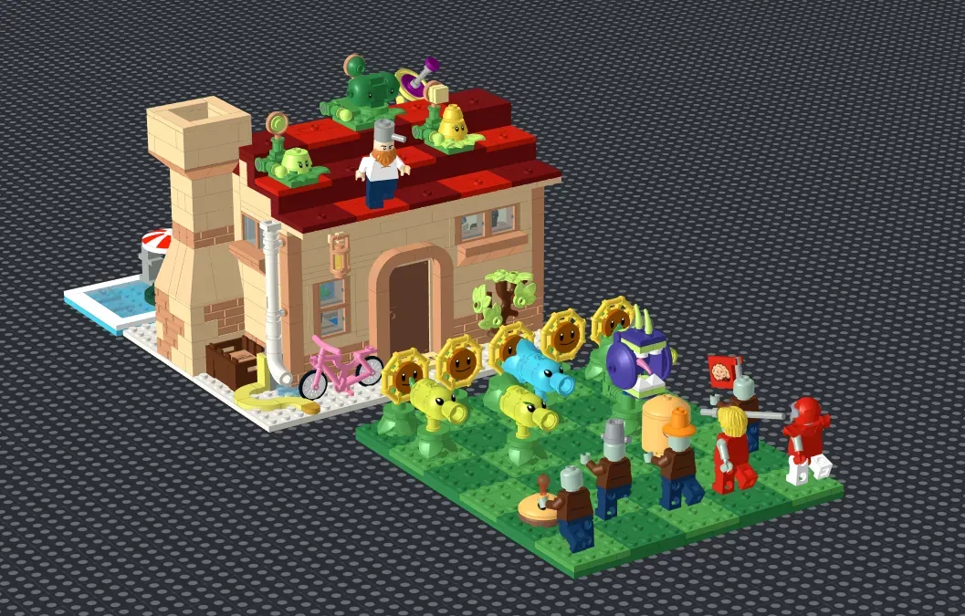
New Additions:

New additions include the singing sunflower, the microphone stand, the Sea-shroom, the gravestones, a duck floatie for the pool zombies, and a new interlocking design for the lawn tiles.
Introducing the brand new plant, the Sea-Shroom, rounding out our plant selection to give every lawn type at least 3 plants for representation. I was considering adding more, like the Squash, Blover, Doom Shroom, Hypno Shroom, Cactus, Pumpkin, Tangle Kelp, etc., but didn’t feel their designs were as good, or as iconic.
While on the topic, here is the work area where I workshopped a lot of the plant designs. It’s a bit of a mess but shows some of the preliminary designs still floating around.

On the roof, I added the satellite dish, an omission I caught too late in development to add initially. It can get in the way of some of the tiles, but I think it really adds to the texture of the roof.

The singing sunflower and the microphone were added as a reference to the music video at the end of the game, now you can serenade your zombies to your heart’s content.

The graves were added to help differentiate the night front lawn from the others. I don’t think I can recreate the fog, but these made for a nice addition to round things out.

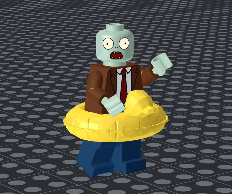
The duck floatie was something I wanted from the start, but unfortunately tracking down the part was a whole journey in and of itself. It hasn’t been added to LDD, Stud.io, Mecabricks, or even the LDraw library. I eventually fell down an internet rabbit hole and finally found this site, where I was finally able to get some very rough preliminary files and implement them into the project. I didn’t end up printing it because I was past that point by the time I managed to track the part down, but I’m glad to have it, if nothing more, as proof of the triumph of the human spirit.
The final new addition was new interlocking lawn tiles. Something bothering me from the initial design was how the tiles could so easily slide around, but that was also necessary for structural stability and preserving the height. I think I’ve finally landed on a design that checks all those boxes.

Behind the Scenes Stuff
Rendering Techniques
In terms of rendering, I bumped the resolution from 1920x1080 to a whopping 2160x1440. I know, I know big stuff, what more could possibly be done.
I normalized the lighting setup with an HDRI to reduce glare. Now instead of being rendered on a blank background, the models are rendered on a black base, giving them better light and shadow patterns. I took a lot of inspiration from gman13579 and dimexart to get better renders. I really wanted to make a photoreal render for the main image this time. I don’t think I quite got there, I think it’s something to do with the lighting. I got a lot of help from PolyHaven and browsing the Blender Bricks community. Some of my later renders included other objects to try and better sell the “illusion” but they broke the rule Ideas has against including outside objects. I still like the look though.

Making GIFs/Animations
The animations were made using Blender, and they were both redone for this update. The cabbage-pult animation finally matches what I wanted originally. I always wanted that sort of juggling movement, but before, I didn’t have that much experience and just simulated it, making more controlled actions impossible. This time I hand-did the keyframes, learning to animate on curves and using the original as a reference. I think the result ended up pretty seamless. This was also helped by how I rendered it. The lawn plates were relatively simple too, just moving objects along axes, but converting them to gifs was a whole other story.
To save people trying to make similar gifs some time, I’ll spill some of my secrets I learned banging my head against this particular wall for the past few months. When starting, I rendered for a resolution of 1290x860, which is the minimum resolution for Ideas. This was done to save on file size and some steps later on. Blender exported to mkv so I had to convert that to mp4. Before, I would then go to gif then finally webp, but now, I cut out the middleman and went straight to webp. The trade secret is webp, it works just as well as gif and is something like 70% more space efficient, which is really important for Ideas’ limiting 5MB file size limit. I used this site for webp conversion. After that it was onto the grueling process of resizing and reconverting until I got the right size to space ratio. I ended up rerendering the cabbage-pult scene at full resolution because the short length got it much more mileage for the size. The lawn plates weren’t so lucky.
Anything beyond 12ish seconds is a no-go. Even if you manage to fit it under 5MB, cutting every corner, going for the lowest resolution possible, it'll still probably end up getting picked up by the AI moderation system as too grainy or low quality. After three tries and countless renders, I gave up and just added the mp4 directly. It’s stuck to the bottom of the page for only the most curious to find, but hey at least it’s there. I guess that’s kinda like this, comment “Traffic Cone” if you’ve read this far.

Closing Thoughts
The main goal with this update was to make what I was trying to create almost 5 months ago. Not so much focus on adding things rather than make the model as a whole better and more balanced. With this, I think my vision is complete and I am satisfied with the project, at least until I realize I forgot something like oh my gosh the zen garden! I could’ve totally added a- nope, nope I’m done, I’m satisfied, it is complete.
On
100 Supporter Update/ Day 1 Patch
I don't have much in the way of new content but I do have some renders that didn't make it to the final cut.

This gif actually almost made it in but I couldn't get a good balance of file size and quality. Still though, I think it is the best representation of how to reset the lawn.
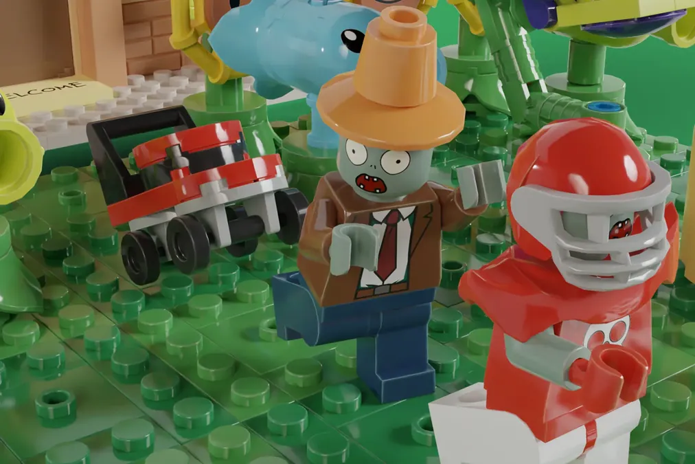
A small display to show off the lawnmower
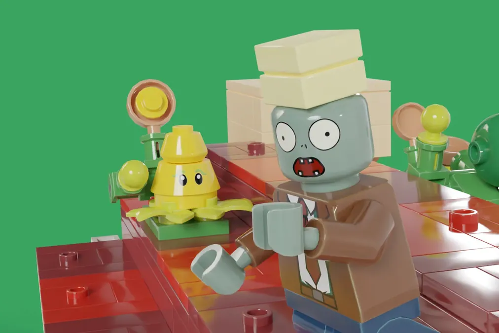
Butter.

I wanted to show that you could actually use the sliding door.
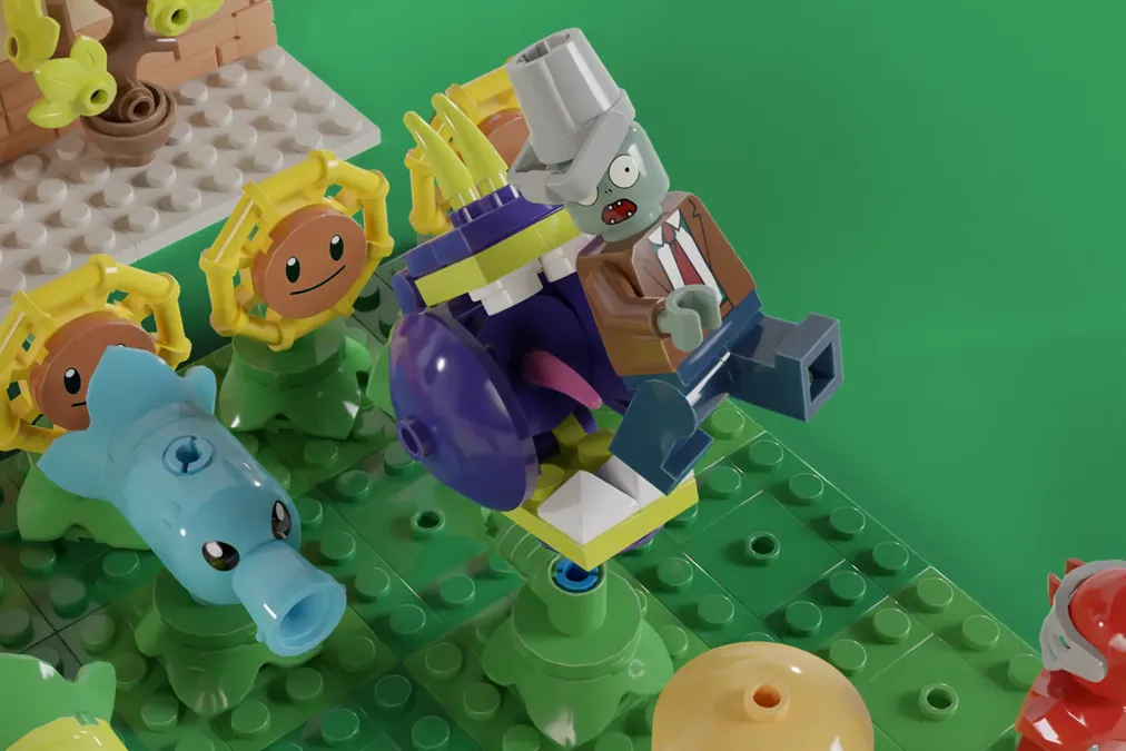
A scene to show off the opposability of the Chomper.


